Putting automation in perspective
Our recent report, From education to employment: Megatrends affecting NZ's working environment, included a discussion of the possible effects of automation on the New Zealand workforce over the next 20 years. The report estimated that 31% of New Zealand’s jobs, or 747,200 jobs are at high risk of automation between now and 2036. But how do those figures compare with the occupational churn that’s occurred over the last couple of decades?
In this article, we find that the potential job losses from automation could be more than five times the job losses in shrinking occupations since 2000. At a regional level, areas with faster economic, employment, and population growth have generally exhibited more dynamism in their workforces over the last 20 years. As a result, it seems likely that they will be better able to adapt to changing workplace needs in coming years.
Shrinking occupations…
We have firstly examined the number of employees in New Zealand across almost 1,000 occupations between 2000 and 2017. If the number of employees in a specific occupation has fallen, it indicates shrinking demand, in absolute terms, for these workers. We estimate that 141,700 jobs across 233 occupations disappeared over the past 17 years. This shrinkage is equivalent to 8.0% of the total New Zealand workforce in 2000.
The occupations with the biggest absolute falls in employee numbers are shown in Graph 1, while the occupations with the biggest percentage declines in employee numbers are shown in Graph 2.
Graph 1

Graph 2

… or underperforming occupations?
But how many employees would there be in each occupation if it accounted for the same proportion of the workforce in 2017 as it did in 2000?
Take logging assistants as an example. In 2000, there were 1,400 employees in this occupation. By 2017, the number of employees was virtually unchanged, at 1,399. In net terms, there had been no redundancies in this occupation as the size of the workforce size still the same. But we estimate that the number of logging assistants was 565 people below a “business as usual” scenario.
New Zealand’s total workforce had expanded 36% over the 2000-2017 period. So if the make-up of the entire economy and workforce had remained unchanged, the number of logging assistants would also have increased by 36%, or 565 people.
By looking at employment from this angle, we’ve captured a much broader range of “underperforming” occupations compared with our previous calculation of 147,100 jobs lost in shrinking occupations. This approach estimates an underperformance of 389,100 jobs across 428 occupations between 2000 and 2017.
The occupations with the largest underperformance in terms of employee numbers are shown in Graph 3. Occupations that haven’t appeared in our previous graphs include:
- general sales assistant (up by 18,666 employees, rather than up by 30,329)
- dairy cattle farmer (down by 1,152 employees, rather than up by 9,415)
- mixed crop and livestock farmer (down by 2,797 employees, rather than up by 4,678)
- general receptionist (up by 1,278 employees, rather than up by 7,742).
Graph 3

Either way, automation looks like a big deal
Whether we consider absolute shrinkage or underperformance of occupations, Table 1 shows that both our figures for the 2000-2017 period are well below our estimated automation risk of 747,200 jobs over the next 18 years.
Table 1

In our view, the absolute shrinkage of 141,700 jobs since 2000 is probably more useful, as it represents jobs that have actually disappeared, rather than jobs that have not been created. That being the case, the potential automation of 747,200 jobs over the next 18 years is more than five times the loss of 141,700 jobs in shrinking occupations since 20001
Drilling down to a regional level
As explained in From education to employment , although job losses due to automation might be spread reasonably evenly across the country, it is most likely that the geographic distribution of jobs being created in new industries and occupations will be quite different.
The experiences of different cities and districts over the last 17 years give us some insight about how the next couple of decades might play out. Graph 4 shows the local authority areas with the biggest rises and falls in total job numbers between 2000 and 2017. There aren’t too many surprises in this list, with an area’s employment performance generally mirroring what has happened in terms of both population growth and economic growth.
Graph 4

Faster growing regions have fewer shrinking occupations…
For all local authority areas across New Zealand, we have then looked at the total number of job losses in occupations where employment has contracted since 2000. Graph 5 shows the local authorities with the highest and lowest proportions of job losses in shrinking occupations over the last 17 years.
Graph 5

Unsurprisingly, there is a strong correlation between cities and districts with strong employment growth and those areas that have had minimal job losses in shrinking occupations. For example, because of the massive growth in total employment over the last 17 years in Queenstown-Lakes, less than 10% of occupations in the district have recorded a decline in employment.
In contrast, areas where overall employment has fallen have generally seen job losses shrink across a wider range of occupations. In Ōtorohanga, job numbers in almost 60% of occupations have contracted.
… but more “underperformers”, as new occupational fields spring up
Our final cut of the data at a subnational level looks at the local authority equivalent of the 389,100 jobs across all New Zealand in underperforming occupations between 2000 and 2017. Graph 6 shows the cities and districts with the highest and lowest proportions of “relative shrinkage” in specific occupations, and it is here that we find the most interesting results. Queenstown-Lakes, which had the fastest overall employment growth in the last 17 years and the smallest proportion of jobs lost in shrinking occupations, has one of the highest rates of relative shrinkage over the same period. Queenstown-Lakes is not alone in this regard, with other fast-growing areas having high relative shrinkage, while slow growing areas have tended to have little relative shrinkage.
Graph 6

Our interpretation of these results is that, in general, the mix of jobs created in faster-growing areas will differ significantly from the mix of occupations that is already present in that area. In Selwyn, for example, the number of software engineers has increased from one in 2000 to 57 in 2017. Dairy products makers are up from four to 129, and “machine operators not elsewhere classified” are up from five to 69. The rapid growth in new job areas means that other occupations look like they’ve been left behind, even if their employment has grown slightly. For Selwyn, occupations that fall into this latter basket include university lecturers, mixed crop and livestock farmers, and defence force members.
Changes in the make-up of an area’s workforce throughout time reflect a level of dynamism in its economy, and the data shows that this dynamism is typically associated with strong growth in total employment. We are not implying that dynamism causes employment growth or vice versa, because both factors can easily be driven by external forces, such as population movements to Selwyn following the 2011 Christchurch earthquake. However, the correlation between the two variables reinforces our view that areas with strong employment growth are also the ones most likely to be able to adapt to the changing occupational requirements of the workplace over the next two decades.
Too many numbers? Keeping the message simple
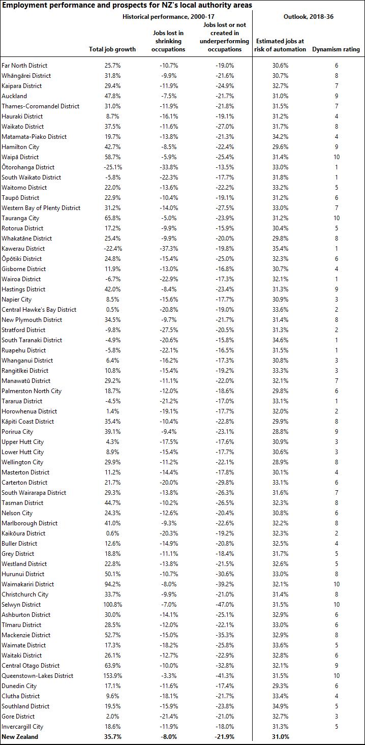
At the risk of providing an overdose of data, Table 2 provides a full list of local authority areas with:
- their total job growth over the last 17 years
- the proportion of jobs lost in shrinking occupations during the same period
- the proportion of jobs lost or not created in underperforming occupations since 2000.
These figures are accompanied by our estimates, previously published in From education to employment , of the proportion of jobs in each area at high risk of automation by 2036.
More simply, we’ve also given the local authority areas a “dynamism rating”, on a scale of 1-10, according to how well we believe they might fare as automation takes place over the next 20 years. As we previously suggested, the larger urban areas are likely to be among the best performers during this period, being natural locations for businesses in emerging industries to site themselves.
However, the rankings also suggest that growth locations on urban fringes could be more dynamic and outperform their neighbouring urban centres. Examples of this phenomenon include Waipā with Hamilton, Hastings with Napier, Manawatū with Palmerston North, Porirua with Wellington, Tasman with Nelson, and Waimakariri and Selwyn with Christchurch.
Table 2

1 We note that even this figure of 141,700 redundancies over the last 17 years could be overestimating job losses in some cases due to occupational classification changes. For example, the loss of over 5,500 “software and applications programmers not elsewhere classified” jobs since 2006 is more than made up for by growth in the number of software engineers over the same period.


